Thursday, June 20, 2013

To Wonderful Opportunities...

In September of last year I answered a Craigslist ad after being on the job search for a few months. I enjoy freelancing, but was looking forward to the opportunity of working on larger projects and being part of a team again. I had sent my resumes everywhere and signed up with a few creative agencies...and yielded nothing. After what felt like an eternity of sending resumes out into a void in space somewhere, I got a response right away.
             "When do you want to come in?"
             "I want to be the first one in on Monday morning!"

Publications International, LTD. publishes everything from children's books to cooking books and brain games. I was an Associate Art Director in the largest department: Children's Electronics. We had several formats and all had sound components. We worked with several large licensors, such as Disney, Nickelodeon, Sesame Street, and countless others. 

They immediately threw me into the pool, so to speak, and I was assigned a project with the Eric Carle license (if it doesn't sound familiar, it's the Very Hungry Caterpillar guy.) It sounded easy when I would explain to friends what I did. You have a library of images drawn by the artists and you have to lay it out with the text. However, licenses all have very strict rules with what you can do. You can't flip Eric Carle images, or scale them too much, or change the color...but it is your job to make it look new and engaging.  It was totally a challenge, but I learnt so much in that project alone. 

My favorite part was when I got to add my own illustrations to projects. You need Mickey Mouse eating a pizza? Well, we don't have any pizza's in the database. More often than not, extensive photo-manipulation went into creating what you needed for the story but, obviously, it had to be seamless. And I was proud of the few items I produced because Disney, or Sesame Street, or whoever- had to ok it. In my free time, I learned to emulate some of my favorite styles. We were encouraged to decorate our cubes and every so often I would put up my newest attempt.

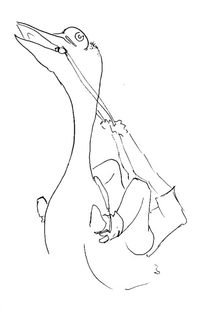
1 bat! Ach ach ach....
My job was two fold: the projects and the comp department. Comp's just refers to materials that we mock-up for Sales presentations, tradeshows, and photo shoots. It serves to give clients an idea of what upcoming books or formats will look like. Complexity ranged greatly- it could be just a spray mounted front cover, to creating entire books with diecuts, pop-ups, or flaps, or cutting and assembling new packaging. This was a large chunk of my workload but it was one of my favorite parts. I had always enjoyed making things and it gave me a chance to learn how to make actual books by hand. During my lunch period, I was often trying to figure out more efficient ways to go about my work and teach myself how to make more realistic looking books. Needless to say, I can wield an Exacto knife like no ones business! 

While it might just seem like menial work on surface, it showed me how important it is to physically hold something than just see a picture of it. It makes the difference with clients to show rather than to just tell them. Also, there is no better way to go about designing a box or a pop-up book without first building and/or tearing apart a few. 

A good example of this would my Little Sound Book: Disney Planes book, which was developed to coincide with the new movies' release. Originally I had made vignettes to go with the fading textures found in the original art. However, what looked good on screen didn't translate so well in the real thing.  Being able to put all the pieces together was a great way to troubleshoot issues before they got the print stage. This was especially true when dealing with the more complex formats.

Unfortunetly, this past week I was laid off due to company wide restructuring of departments. It is always a sad thing, I enjoyed learning from my coworkers and was looking forward to new projects. But I am leaving with a better perspective on what I am capable of. It was an environment with tight deadlines and high expectations which really refined my ability to work under pressure, maintain deadlines, work with a team, and prioritize my tasks. It was a wonderful opportunity and I couldn't have had a better experience. I look forward to put them to use!


Tuesday, July 17, 2012

Website: Under Construction

If you have found your way to my website I can only say that I apologize for the construction! For a while I was using a pre-made portfolio but I found it lacking and decided to undertake a new website for myself. So far, building new items like galleries and such has been a challenge but slowly and steadily I get it to do what I want. A new update is coming soon so I am hoping to speed up the loading time and add new content. I hope to be tweaking it often so that it is always looking and functioning it's best. Check back soon!

Saturday, April 14, 2012

A Series of Surprisingly Surreal Sketchbooks Vol. 2

You know, not all sketchbooks are awesome. Personally, I have quite a few that show an artist uninspired- but I was told to keep working. Work through the block and something will come. These sketchbooks are hard to look through and I like to burn hide them.

Exactly. What in the world is that? I will never know. But- sometimes good things can come from it too. You might just end up drawing the best mermaid ever. EVER.


It's just a reminder, that without the failures there are no successes.


A Series of Surprisingly Surreal Sketchbooks Vol. 1

Vol. 1A few birthdays ago a friend gave me the book An Illustrated Life, which highlights the sketchbooks of a variety of artists. I look through it every so often and it's fascinating how different everyone is. It reminded me today that I really should start sharing some of mine- instead of them just collecting dust on my cramped bookshelf.
In that spirit, today's sketchbook is probably my favorite. It started as an assignment in college and just became part of me. It really allowed me to flesh out the style that was emerging in my work at the time. The first page of this particular book is where I got the elephant that is featured on my webpage. I felt that it was a good embodiment of my personal work- absurd, and a tad racy. But I will let you decide. Enjoy!


I like layering images, as seen above, to create something totally new. The drawing spreads out from a photograph of a dissected uterus whose internal texture had inspired me.


 I define my work by strong black and white line work. I enjoy creating images that teeter between minimalist and ornate.

 This illustration was later turned into a lithograph. I was thinking a lot about identity and consciousness in that time and this was born from that.

"Doctor, my liver has escaped me!"


Sunday, April 1, 2012

A Quick Guide to Logo, Branding, and Identity

It's important as a client to distinguish between these three. Mind you , that is no easy task, but let's boil them down to the basics.

Logo: We all know what a logo is. The Nike swoosh or the Apple...apple. It is the visual shorthand for a companies name. Your logo doesn't have to tell people literally what you do, like if you are a plumber your logo does not have to show pipes and a wrench to be effective. What does a logo have to be then? Simple, clever, and memorable. On it's most basic level it should translate well across all mediums. Whether it's on the side of a building or on stationary- a simple design should translate well anywhere.

Branding: This is what separates your business from others. Through the use of logos, slogans, catchphrases, or even flavors, you create something that is recognizable as being unique to you. The shape of a Volkswagen Bug, for example, or the Coca Cola bears. Once people know they can trust your brand (brand loyalty) they are more willing to try new products.

Identity: In a sense this is the soul of your company. Identity uses logos and branding to establish the philosophy of your business and how you want others to see you. Take a restaurants- sure they all serve food- but their identity immediately lets you know what to expect. Are they a chic little place with an adventurous menu or are they a throwback to the family diner? By using a cohesive set of typefaces, page layouts, and color schemes, the company creates associations to itself that attract its' ideal customers. Maybe an emphasis on efficient service will attract your customers, or the idea of an environmentally friendly product?

Essentially, these three work together to create the look and feel of your business. Now, how important is this? Very. Even if your a small company, you benefit from having a cohesive look. It makes you look professional and sets you apart. Would you rather do business with the company that has a fuzzy logo and clipart on their brochure or the one that has sleek layouts and sharp photos?

The first step is to figure out what it is that makes your business stand out amongst the competition. Once you know that you can figure out what kind of customer "fits" that and how to market to them.

Tuesday, March 6, 2012

Having Yourself as a Client

The past few months have been largely spent finishing the embryology project. So far, it has been very gratifying. Now that it is near completion I need to turn inward again. The first thing I need to do is revamp my business. I am getting older and learning from my past mistakes. Slowly I have introduced contracts into my process, a more formal pricing guide...this is starting to look like a real business! And it needs to be to serve both my customers and I.

Currently I am revamping my website and entire identity. I have stalled on this for a little while. When you are an outsider it is easy to look at a company and immediately know what it needs, where it's strengths and weaknesses lay. When it's your own company it's harder to separate all those knots. However, it reminds me that a business is an evolving creature. Instead of being frozen in place seeking perfection- sometimes all you can do is just throw yourself into it. That alone is a great learning experience.

I am approaching my own identity by trying to narrow down what I do. I am interested in everything and have to constantly rope myself in from trying to be a jack of all trades.  This is both a strength and a weakness in one. By focusing my services to my strengths I hope to give my clients the best of me. Branding and illustration. I would say that those are the two things I am absolutely passionate about. Something about looking at a business and trying to distill it to it's absolutely core components is a challenge. Even more so is making sure that is conveyed to the consumer.

My personal challenge in having myself as a client is that my illustration has two very different sides. One is the surreal and cartoony. My newspaper clients expect this fun, stylized side. On the other is my medical work. I am not yet certified, but I try to produce work that is as accurate as it is pleasing to the eye. Do I make a clean, sleek and clinical identity for myself? Do I give in to the creative and fun? Ultimately, the answer is somewhere in the middle.

Saturday, September 17, 2011

Outstanding Festival Poster Designs

Some great examples of festival fliers. Gorgeous stuff collected by a design blog worth checking out.